
Funnels
Created by: Emma Johnston
Last Updated: July 17, 2024
Text / Buttons / Images / Image Slider / SVG / Divider / FAQs / Progress Bar / Countdown / Order Forms / Forms and Surveys / Video / Calendars / Reviews / Social Icons / Map
Funnel Elements
You can add a variety of elements to a funnel page including headings, paragraphs, bullet lists, images, forms, payment forms, calendars, surveys, and buttons.
ADDING ELEMENTS
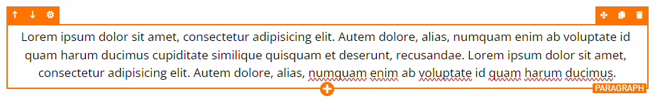
To add an element to a new page, first add a new section and a row and then click on the orange + Add Element button. When adding additional elements, you can select an existing element and press the + icon at the bottom of orange box or you can click on Add Elements icon in top menu bar.
MOVING ELEMENTS
To move an existing element up or down, select the element and click on the arrows in the top left corner of the orange box. To drag an existing element to a different place on the place, hold down the Drag icon in the top right corner of the orange box and move the element to its new location (and then release).
CLONING ELEMENTS
To clone an existing element, select the element and click on the Clone icon in the top right corner of the orange box. Cloning existing elements, such as text, is usually faster than adding a new elements (as the settings for that element also clone).
DELETING ELEMENTS
To delete an existing element, select the element and click on the Trashcan icon in the top right corner of the orange box. This will immediately delete the element.
UNDO/REDO
If you make a mistake (such as accidentally deleting a element), you can press undo on the right hand side of the top menu bar.
MANAGING ELEMENTS
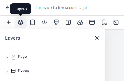
You can also manage sections, rows, columns or element, by clicking the Layers icon in the top menu bar. Here you have the options to can reorder, hide or show, edit, clone and delete. This can be especially useful when a section, row or column has no padding and you cannot select it easily.
CUSTOMIZING ELEMENTS
Clicking on a element will bring up a settings menu on the right-hand side, allowing to completing customize that element. Depending on what has been selected there will be a General tab and an Advanced tab, each giving different options. Options will include background images, background colors, padding, margin, fonts, font size and font colors, shadows, borders, text transforms. You can set a redirect action on a form, survey, button, calendar, etc.
Text (Paragraphs, Headings and Bullet Lists)
TYPOGRAPHY
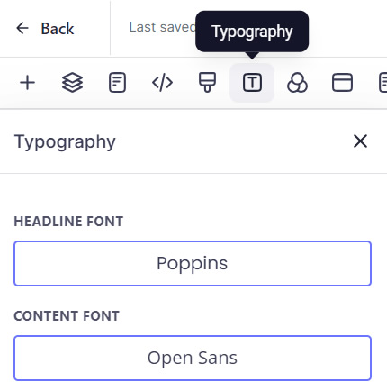
To change the default heading and paragraph fonts for the page, click on Typography icon in the top menu bar. To change the headline and/or paragraph font, click on the font name and then choose a font from the dropdown list. If you know the name of the font you want to choose, you can type the first letter or two to jump down the list. Click here for a full list of fonts available.
TEXT PADDING
TOP TIP: We recommend adding at least 10px of padding left and padding right to headings and paragraphs so the text isn't touching the edge of the screen on mobile.
TEXT FORMATTING
To change the formatting of specific elements of text, drag you mouse along the required text and then select the option from the light grey menu that appears below the text.
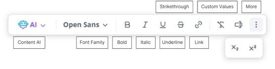
There are options to change the font family for the highlighted text, change the formatting (bold, italic, underline, and strikethrough), add hyperlinks and custom values, and make the text subscript and superscript. For bold, italic and underline formatting, keyboard shortcuts can also be used.
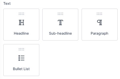
HEADINGS, SUBHEADINGS AND PARAGRAPHS
To add a heading, subheading or paragraph, select Headline, Sub-headline or Paragraph from the elements menu. By default, the font for heading and subheadings will be the headline font set in Typography, and the font for paragraphs will be the Paragraph font. Once added, click on the element to bring up the settings menu.
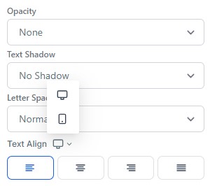
In the General tab, you can change the text alignment, font size, font weight, padding and margins (all of which have separate options for desktop and mobile). You can also change background color, opacity, letter spacing, typography font, and text color (for each style of formatting). You can also add an icon.
In the Advanced tab, you can line height for the text (which has separate options for desktop and mobile), transform the text case, and change the visibility. You can add a box shadow or text shadow (where you can change the offset, blur and color). You can also add a border (which brings up options to change the border radius).
NOTES: If any of your headings or subheadings contains a long word, such as 'accountability' or 'congratulations', we recommend checking the word fits on mobile and changing the mobile font size if needed.
BULLET LIST
If your paragraph text contains a bullet point list, this must be added a separate element. To add a bullet list, select Bullet List from the elements menu. By default, the font will be the headline font set in Typography. Once added, click on the bullet list to bring up the settings menu.
In the General tab, you can change the background color, opacity, text shadow, letter spacing, mobile and desktop text alignment, mobile and desktop font size, typography font, and color options (for each style of formatting), list icon, padding and margins. In the Advanced tab, you can add a border (which brings up options to change the border radius). You can change the line height and transform the text case.
NOTES: The default Line Height for bullet lists is 1. We recommend changing this to at least 1.5 (or whatever you have set for your paragraph font). You may also want to change the Typography Type to Content Font.
Animating Text
ANIMATING TEXT
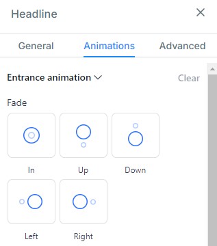
You can apply animations to headings, subheadings, paragraphs and bullet lists. The different effects you can choose from include fade, slide, bounce, flip, rotate, zoom and light speed. Once added, click on the text to bring up the settings menu.
In the Animations tab, choose the animation that you want to apply (clicking on each option will preview the effect). To remove the animation, press clear.
Images
IMAGES
To add a single image, select Image from the elements menu. Once added, click on the image to bring up the settings menu. To change the image, scroll to Image Options in the General tab and click on the Picture icon. You can then select an existing image, upload a new file, generate an image using Content AI or search for free images on Pixabay and Unsplash.
Click here for more information on how to use the Media Library.
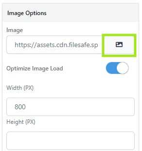
In the General tab, you can change the padding and margins, background color, image file, width and height (see notes), alt text. You can also add image actions, such as adding a hyperlink or opening the pop up. In the Advanced tab, you can change the image radius, image border, image shadow, and image effects (color or grayscale).
NOTE: It is always best practice to only define the width of images (and leave the height blank), so that they resize proportionally on mobile.
OPTIMIZING IMAGES
Large, uncompressed images will dramatically slow down the page load time so it is important to resize and compress images so that your pages load quickly.
Unless your image is transparent, always save your images as a JPEG file, not a PNG file. PNG images have a significantly larger file size than other formats. Then use a tool such as tinypng.com to change your image photo to WEBP to compress your image and reduce the file size.
Another option is to enable Image Optimisation in the funnel settings. With this option, it is always worth checking whether the images will look sharp when viewed on mobile. If not, disable this settings.
Image Slider
IMAGE SLIDER
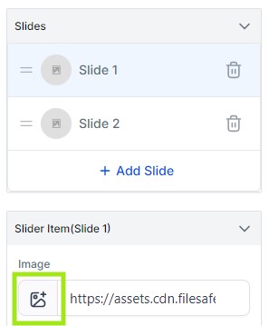
To add multiple images, select Image Slider from the elements menu. Once added, click on the image to bring up the settings menu. In the General tab, select Slide 1 and click on the Picture icon below to select an image from the Media Library. You can also add a hyperlink if required. To add the next image, click on Slide 2 and click on the Picture icon again.
To delete the unwanted images by clicking on the trashcan icon. To add additional images, click on + Add Slide. To rearrange the order of the images, hold down the grippy lines and drag the icon.
In the General tab, you can also set the height and width for the slider. In the Advanced tab, you can change the margins and padding (which has separate options for desktop and mobile). You can add a box shadow (where you can change the offset, blur and color). You can also add a border (with options to define border thickness, border color, corner radius and style) and change the box shadow.
SLIDER ANIMATIONS
In the Advanced tab, you can edit the animation effect of the slider, arrow style and pagination options (or turn these off completely). For the animation effect, you can choose between slide, fade and ease in. When Auto-Animate Slides is enabled, you can define the number of seconds the slides show for, select infinite loop and whether to pause the animation on hover.
When Slide Arrows is enabled, you can choose the arrow color and animation. When Pagination is enabled, you can choose the style, active/inactive color and size.
SVG Graphics
SCALABLE VECTOR GRAPHICS
SVGs can be used for graphics such as icons or logos. They have a much smaller file size than image file, they are sharper and you can change their color.
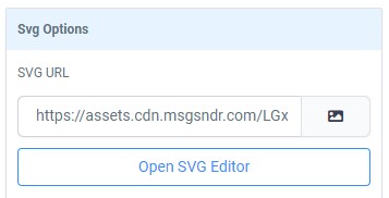
To add a scalable vector graphic, select SVG from the elements menu. Once added, click on the image to bring up the settings menu. To change the image, scroll to SVG Options in the General tab and click on the Picture icon. Select the required image from your media or upload a new file.
In the General tab, you can change alignment, margins, width and height (see notes), and svg actions. You can also open the SVG Editor, where you can change the color of the graphic.
One of our favorite icons sites is Flaticon. You filter the results to make it easier to find the style you want, and then you search by collections (so your icons match each other). When downloading the icon, choose the SVG option. Please note that, unless you have a premium subscription, attribution is required in the page footer.
Content AI
CONTENT AI
You can use the inbuilt AI tools to create or improve content. For text, click on the AI button in the toolbar. The system will guide you through options like generating text, improving grammar, adjusting tone, or changing length. Just click on the option you want and follow the on-screen prompts. You’ll be asked to provide any details needed to refine the output.
If you’d like to go further, you can set a custom brand voice under Marketing > Brand Board > Brand Voice.
IMAGE AI
If you want to revisit text or images created with AI, go to AI Agents > Content AI. From there, you can toggle between text and image to view your previously generated content.
CONTENT AI COSTS
Content AI and Image AI are premium features that are charged based on usage. The first 500 words of text are free, and after that the price is $0.15 per 1,000 words generated. Image AI is $0.096 per image generated. For reference, $10 will give you about 105 images or more than 65,000 words.
Buttons
ADD A BUTTON
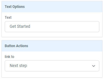
To add a button, select Button from the elements menu. Once added, click on the button to bring up the settings menu. In the General tab, scroll down to Text Options to change the wording on the button. Next, set the Button Actions (such as next step, open popup or website url).
In the General tab, you can also change the text alignment, font size, font weight, padding and margins (all of which have separate options for desktop and mobile). You can change button background color, letter spacing, typography font, icons (before and after), and text color.
In the Advanced tab, you can transform the text case, adjust the width (fluid or full), and change the visibility. You can also add a box shadow or text shadow (where you can change the offset, blur and color). You can also add a border (which brings up options to change the border radius).
For additional themes, open the Buttons tab in the Add Elements menu.
BUTTON BORDER RADIUS
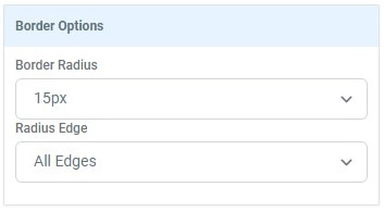
To make a button round, change the Border Options in the Advanced tab to Full Border. To create round corners, edit the Border Radius to a value larger than 0px. You can apply the border radius to all edges, the top edges only or bottom edges only. If you also want to change the button Border, you can set the style, width and color. Otherwise, you can change the Border back to No Border.
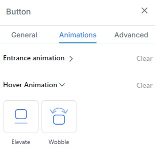
ANIMATING BUTTONS
You can apply entrance and hover animations to buttons. The different entrance effects you can choose from include fade, slide, bounce, flip, rotate, zoom and light speed. There are also infinite looping effects such as glow, rocking and bounce. Hover animations include elevate and wobble.
Once added, click on the button to bring up the settings menu. In the Animations tab, expand the entrance animation section and choose the animation that you want to apply (clicking on each option will preview the effect). Next, expand the hover animation section and choose the effect that you want to apply. To remove the animation, press clear.
Divider Line
DIVIDER
To add a divider line, select Divider from the elements menu. Once added, click on the line to bring up the settings menu. In the General tab, you can change the padding and margins, line color, alignment, width, height (thickness) and style. In the Advanced tab, you can set visibility.
NOTES: The line width applies to both desktop and mobile. If you have changed the desktop line to 20%, for example, to match the width of a title, this will look quite different on mobile.
Videos
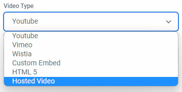
VIDEO AND HOSTED VIDEO
To add an video, select Video from the elements menu. Once added, click on the video to bring up the settings menu. In the General tab, scroll down to Video Type and select the video source.
For externally hosted videos, such as YouTube or Vimeo, add the Video URL and select the whether you want the video to autoplay and/or display the controls. Note that you can use hyperlinks and custom values/custom fields for the URL.
For internally hosted videos, select Hosted Video. Click Select Video to select a video from the media library (or upload a new file) and click Select Thumbnail to select an image from your media library. Go to Playback Controls and select the playback options (such as autoplay, allow play/pause, speed control, show pending time, full screen toggle, progress bar).
In the General tab, you can also change the padding and margins, background color, box shadow and video width. In the Advanced tab, you can change the border and border radius, and set the visibility.
NOTES: Hosted video can be in any of the mainstream video formats as long as it is under 4GB. According to regulations, autoplay videos must start muted. This policy is controlled by the browser manufacturers and cannot be changed.
PICTURE IN PCITURE MODE
For hosted videos, there is also the option to Enable PiP Mode on Scroll. As your users scroll down on the page the video will follow them down the page so they can keep watching as they scroll.
GATED VIDEO
If only want viewers who have opted in to be able to watch the video, you can toggle on Redirect Unregistered Visitors. Once that has been toggle on, select the step you want to use for contacts to opt in.
HOSTED VIDEO AUTOMATIONS
You can trigger automations when a contact watches all or part of a particular video.
1. Click on Automation > Workflows and click the green + Create New Workflow button in the top right of the screen.
2. Choose an option for the type of Workflow you wish to create, such as Start a Workflow from Scratch, and click the + Create New Workflow button again to enter the builder. Add a workflow name and press Save.
3. Click Add New Workflow Trigger and select Video Tracking. In Add Filters, select the Funnel, Video or Video Duration. You can add a second filter if needed.
4. Click the + to add a new event to the workflow, such as Send Email or Send Internal Notification. Choose and customize the action in the menu on the right.
5. Add any other required steps.
6. Press Save and toggle on Publish
Adding FAQs
ADDING FREQUENTLY ASKED QUESTIONS
You can add frequently asked questions as text. There is also the option of adding an FAQ with expandable questions.
To do this, select FAQ from the elements menu. Once added, click on the FAQ box to bring up the settings menu.
To edit the first question, click on List Item 1 in the FAQ List in the General tab but then edit the text on the funnel page. You can also deselect Show Image or, if you want to have an image, you can select the image file.
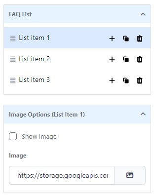
To edit the second question, click on List Item 2 and edit that text on the funnel page...and so on. You can also rearrange questions, add new questions, clone questions and delete questions in the FAQ List.
FORMATTING FREQUENTLY ASKED QUESTIONS
In the General tab, you can change overall design by selecting the FAQ Type (separated, contained, or simple). In the Advanced tab, there are several options to change the design on the questions.
Under Custom Options, you can change icons that open and close the sections, and the position of the icon. You can choose whether multiple items can be expanded at same time and whether you want the first question to be expanded when the funnel is first loaded. You can add button to expand/collapse all questions. You can also change the line height of the text.
Under Color Options, you can change the color and background color for the titles when they are open and when they are closed. You can change the title color and background color, the link text color and the color of the separation line. You can also format the expand/collapse button if you have added one.
Under Font Options, you can change the font family for the title and text. To change the font size for the title and text, you need to toggle between Change Mobile Font Size and Change Desktop Font Size respectively.
Under Spacing Options, you can change the padding and margins, and in Border and Shadow, you can change the border, border radius and box shadow.
Progress Bar
PROGRESS BAR
Adding a progress bar can be particularly useful when you add a step between the first call to action and the confirmation, such as a one time offer upsell page or a waiver form.
To add a progress bar, select Progess Bar from the elements menu. Once added, click on the progress bar to bring up the settings menu. In the General tab, you can change the wording of the progress bar in the Text Options box.
In the General tab, you can also change the background color, font, and margins. In the Advanced tab, you can change text shadow, style and alignment. You can change the width of filled progress section (as a percentage) and the size (height) of the bar. You can also change the offset color. There are also options to change the progress bar border and add a box shadow.
For additional themes, open the Progress Bar tab in the Add Elements menu.
Countdown
COUNTDOWN
You may want to add a countdown to indicate a signup deadline or when a program starts. This can be a useful tool for creating urgency. You can also add a timer to indicate a limited-time offer, but it is worth noting that because these have been over-used to create false-urgency, they do not have the same impact as they once did.
You can one-off countdown clock and timers to individual funnels, or you can create system-wide countdown clocks, which can be used in both funnels and emails. You can also use countdown timer to hide and reveal elements.
Click here for more information.
Forms and Surveys
FORM AND SURVEYS
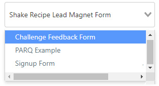
To add a form or survey, select Form or Survey from the elements menu. Survey is found lower down in the elements menu in the Custom sections of the elements menu. Select the form (or survey) from the dropdown list in the popup window. This list will contain all of the forms that have been created in Sites > Forms. Click here for more information about creating forms.
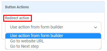
Once added, click on the form to bring up the settings menu. In the General tab, scroll down to Button Actions to define the Redirect Action. The default redirection action is set to use the action from the form builder (as set by the Action on Submit). For surveys, this redirect action won't happen until the contact has completed the whole survey.
To change the current form to a different form, go the General tab. Just above the Button Actions section, click on the down chevron next to the form name to expand the drop down menu. Either select the required new form from the list or, if you know the name of the form, you can search by typing in the form name.
In the General tab, you can also change the padding and margins. in the Advanced tab, you can change the visibility. If you want to change the appearance of the form, you need to do that in the form builder. Click here for more information about formatting forms.
Calendars
CALENDARS
To add a calendar, select Calendar from the elements menu. Select the calendar from the dropdown list in the popup window (or select the calendar group page). This list will contain all of the calendars that have been created in Settings > Calendars. Click here for more information about creating calendars.
In the General tab, you can change spacing options, select a different item and define the Redirect Action (such as Go to Next Step). In the Advanced tab, you can change the visibility.
Review Widget
REVIEWS
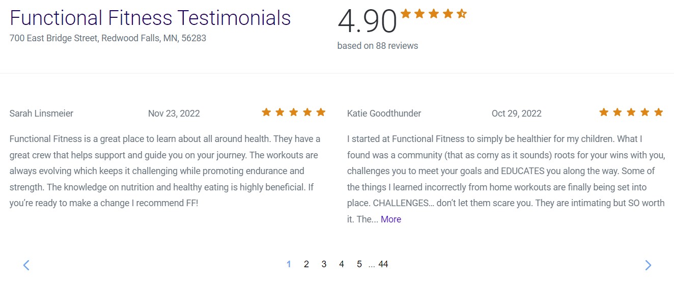
Reviews and testimonials are really important for social proof, improve your trust factor and give your audience that one final push to buy your product or service.
If you have connected Facebook and/or Google Business to SuperCoach CRM, you can display your all of amazing reviews as a widget on your funnel page. To add these, go to either the Launchpad or Settings > Integrations.
To add a review widget, select Reviews from the elements menu. To format the appearance of review widget, go to Reputation > Widgets. Customize the widget by changing layout (including review source and number of reviews shown), content (title and description), theme (light or dark) and appearance (header title, title color, star rating color, and/or background color), and settings.
REVIEW WIDGET CODE
To add the widget to a website hosted elsewhere, go to Settings > Reputation Management and scroll to the bottom of the page, Click Copy Code and paste that code into an HTML block on your site.
Social Icons
SOCIAL ICONS
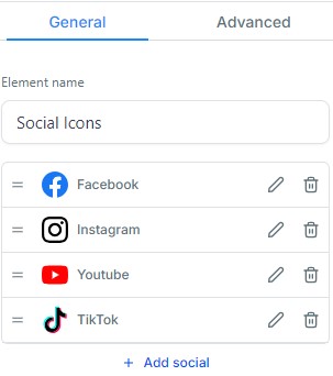
To add social icons, click on the Social Media Icons section in the elements menu, and select the required style (square, brand, dark, rounded dark or light gray).
In the General tab, delete the unwanted icons by clicking on the trashcan icon. Add the hyperlink for each icons by clicking on the pencil/edit icon. To add additional items, click on + Add Social and then select required type from the drop down menu. To rearrange the order of the items, hold down the grippy lines and drag the icon.
In the General tab, you can also change the display type (text, icon or both), change the alignment (which has separate options for desktop and mobile), and set the icon width and height.
In the Advanced tab, you can change the font family, font size, font weight, padding and margins (all of which have separate options for desktop and mobile). You can change the visibility.
Maps
GOOGLE MAP
To add a map, select Map from the elements menu. In the General tab, under Map Options, click on the Open Search Box to enter the required address. Choose the Map Type (road map, terrain, satellite or hybrid) and select the level of Zoom.
In the General tab, you can also change the marker color, alignment (which has separate options for desktop and mobile), height and width. In the Advanced tab, you can change the visibility.
EMBED A MAP
You can also embed a map from Google Maps. Open Google Maps and search for the required location. Click on Share in the left hand panel. In the pop up, select the Embed a Map tab and copy the embed code.
Next, in your funnel, select Code from the elements menu. In the General tab, click on Open Code Editor and paste the embed code. Press Save to finish.

If you have a quick, system-specific "how-to" question, you can chat with our L1 Technical Support Team using the purple chat bubble in the bottom corner of the software. This team offers live chat 24/7, giving you instant access to help at any time of day.
If you have a more complex or outcome-specific “how-to” question, or a query about project requests, done-for-you resources, or Coach Catalyst, you can email our L2 Specialist Team at [email protected]. This team is available Monday to Friday, 8:00am – 1:00pm (EDT).
© 2026 SuperCoach CRM